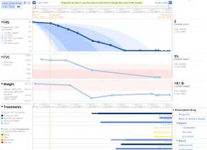
Today, we’re announcing an exciting major upgrade to our PatientsLikeMe platform – new profile charts with significant functional improvements.
We started PatientsLikeMe with the idea that visualizing your condition and treatment history over time is a powerful way to understand the impact of your treatment choices and tell the story of your progress to other patients like you. So, we designed the website with the profile charts as the centerpiece around which the rest of the site activity is organized.
The new profile charts, which we’re rolling out today in the ALS community, are designed to help you understand your own profile better and tell your story more effectively. Ultimately, these charts will help you answer the question: “Given my status, what is the best outcome I can expect to achieve, and how do I get there?”
Here are some of the functionality improvements the members of our ALS community will notice:
- Charting of treatment side effects. If you have reported side effects for a treatment (by filling out a treatment evaluation), you can now see them plotted on your profile underneath that treatment.

- Charting of treatments taken for a symptom. If you have reported that you are taking a treatment for a particular symptom (by filling out the information in the treatment’s “purpose” section), you will see those treatments on your profile plotted underneath the symptom.

- Customizable timescale. It is now easy to see your history over various time spans from 1 month all the way up to the entire history, all at the click of a button.

- General visualization clean-up. We made some design improvements to make the charts easier to read, such as the visualization of the treatment dosage changes.
What our members will notice more than any of these improvements is that when you interact with the chart (by zooming, opening/closing charts or side-effects, etc.), the interaction is smooth and instantaneous. This is because we completely overhauled the technical platform we are using to display the charts. We think that this new technology will make it quicker and easier for us to give you even more chart innovations in the future.
(For the technically inclined, the old charts were static images with Ajax mouseovers and timeswitchers, and the new charts use Flash technology. Note: All members must have the necessary Flash component installed to display the charts and, in some cases, a Flash installation upgrade may be necessary).
As with all our pilot programs, we will be testing it out to make sure it’s working well for our members. Once everything is working smoothly, we will roll the charts out to our other communities. But even more exciting, we want to continue to add charting innovations, such as the ability to re-order treatments by purpose (treat my condition, treat a symptom, etc.) or overlay the profiles of other patients just like you.
These new charts are the first of many new exciting upgrades to the PatientsLikeMe platform this year. We add these enhancements because we want to stay true to our core values: putting “Patients First” and making changes that “Create Wow!” We hope you agree.
Do you have feedback on the charts or how we’re doing in general? Please let us know!


ALS charts look awesome!
Pingback: The Value of Openness: The PatientsLikeMe Blog » ALS Awareness 2010: A Four Year Journey With Our PALS